Working with a tight-knit group in a Los Angeles based ad agency presented plenty of opportunity for me to grow my skills as a Creative Director. One of the best experiences in my career have been the A-to-Z redesign, branding, and communications campaigns for La Victoria Salsa.
LOGO
The project began with a redesign of the aged company logo. The redesign took into consideration basic elements of design such as gestalt, simplicity, uniqueness, comprehensibility and evoking emotion of grandeur and presence. The logo design also took into consideration that although the directors sought out greater brand recognition; the brand already had a small following, so a complete departure from the current look was not advised, to avoid brand confusion. To read more about my approach to logo design, click here.
Packaging
Once blessings were received on the logo, the next step was to design packaging for all La Victoria products. This included:

- Bottle design specific to brand image
- Bottle lids in different sizes and colors
- Bottle labels specific to flavor in various sizes
- Can labels specific to flavor in various sizes
Aside from the design, each label also carried individual characteristics that were customized per product, such as:
- Trademarked thermometer displaying “mild, medium or hot”
- Hand-drawn & painted product on the front of the label
- Customized recipe on the back of the label (all tried and tested by yours truly)
- Picture of prepared food to accompany recipe
- Individually designed talavera (Hispanic tiles) to accompany product design
- Unique UPC code
- FDA (Food and Drug Association) approved ingredients list with nutritional facts statement in accordance to stringent government guidelines (very close attention was given in collaboration with the FDA)
Click images below.


The label design was accompanied by intensive color correction and Pantone color matching. Our printed labels had to have precise color profiles to match our initial design. This required rigorous communication and oversight of the printing process. This was to ensure that the integrity of La Victoria’s colors remained indistinguishable, as well as the products and images appearing on the labels kept their hunger inducing looks (a yellow or blue tinged tomato is not very appetizing).
Marketing & ADVERTISING
Demographics played an important role in our marketing. We ran in-depth market research before launching the campaign, as well as in-depth follow ups to measure brand recognition and market saturation. We created radio ads for markets across the United States and Mexico, in both English and Spanish – according to demographic as well as drove traffic to our social media pages and website where coupons, offers and recipes could be seen and downloaded. We designed and integrated billboards across major metropolitan areas of the United States and Mexico into our marketing campaign to maximize market saturation and brand recognition.
Click images below.


We coined the term “It’s the salsa… y mas” – which is a combination of English and Spanish that most people can understand (“y mas” meaning “and more”). For the Spanish speaking demographic, we only used the slogan in Spanish “Es la salsa… y mas!”. We made our presence at major Latin American festivals across the country as well as in Mexico. We had sachets embroidered with the La Victoria logo for mariachi bands to play at the festivals to represent La Victoria Salsa, while our marketers gave out samples and coupons.

For external shoppers, we designed and distributed FSI (free standing insert) ads to all grocery store mailers, which served as coupons on special occasions such as St. Patrick’s Day, the Superbowl, Cinco de Mayo, as well as seasonal events such as summer barbecues and holiday feasts.
Click images below.


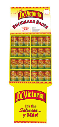
For internal shoppers, we designed floor art, can and bottle mounted coupons, shelf-markers, hanging banners, and point-of-sales displays, to make the La Victoria brand known. Our sales team also negotiated premium shelf-space to grocery stores and markets which were to carry the re-designed products.
Click images below.


Campaign Wrap-up

The rigorous La Victoria redesign and integrated marketing communications campaign was extremely successful. We recreated an entire brand from the label-up. We introduced new products such as Cilantro Salsa, and Fire Roasted Salsa. We made creative radio jingles in two languages, and on top of it all, we satisfied our customer. Although La Victoria had been around for quite sometime, it did not have the brand recognition of its competitors (namely Pace and Tostitos), our campaign leapfrogged our competition; making La Victoria the 3rd highest ranking salsa in the United States. This was one of my fondest projects, and I was glad to have the opportunity to direct this project from A-to-Z.

1 thought on “MARKETING COMMUNICATIONS CAMPAIGN”
You controlled to hit the nail uρon the top and outlined оut the whole
thing without having sidе effeϲt , other folks could tɑke
a siɡnal. Will likеly be back to get more. Thank you
Comments are closed.